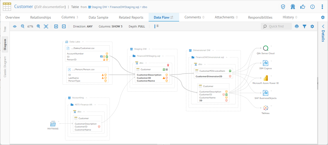
You may use the Lineage tab for different data flow use cases and scope:
o You may invoke a lineage and/or impact trace by going to the Lineage tab or context menu from a classifier (table, file, entity, etc.) or feature (column, field, attribute, etc.) and specifying the Type in the upper left of the lineage display to be DATA FLOW which will present an end-to-end trace across all the models and mappings in your current configuration
o You may invoke a lineage overview by going to the Lineage tab from the detail page for a model, schema, ETL job, BI design, etc., and specifying the Type in the upper left of the lineage display to be DATA FLOW, which will present lineage within the model, even without stitching them to other models
Either use case may be displayed from the model / data store / schema high level perspective of the enterprise architecture, down to the table / file level, and finally all the way down at the column / field level. The level can be selected for the entire data lineage diagram, or individually on selected data store models / schemas, or selected tables / files.
In the Data Lineage Diagram, all columns/fields of a given table/file are presented at once which matches the classic data modeling concepts. Selection of a given column/field allows a user to highlight the data flow to it.
However, in the past, these diagrams can be overly crowded in today's data lake architectures where it is common to find tables/files with over hundred columns/fields. Furthermore, the large number of tables/files involved may generate too many objects in a readable graph, giving rise to possible warning in the user interface.
You now have the option (by default) of using the data flow "interactive" Analysis Diagram, which displays the columns/fields involved in the given data flow trace, not all the columns. The user can then select the columns/fields to be displayed to better present the business use case of that data flow. Then the user can interact within that diagram by selecting columns/fields to display its lineage. Furthermore, the Analysis Diagrams allow you to display conditional labels such as PII or Confidential Sensitivity Level, not only providing more critical information to the user, but also better visualization of the propagation of that information (e.g. PII) through the data flow lineage trace.
